

GoPro is the world’s leading action sports camera company. They defined a new marketplace with an innovative line of small and rugged cameras that let anyone capture and share their adventures. GoPro continues to push the boundaries of wearable, gear-mounted cameras and accessories.
Briefing
Typography & Color Pallette
PF Din
A B C D E F G H I J K L M N O P Q R S T U V W X Y Z
a b c d e f g h i j k l m n o p q r s t u v w x y z
Outer Space
#3F5153
Vivid Cerulean
#00ADEC
Green (Crayola)
#27AE61
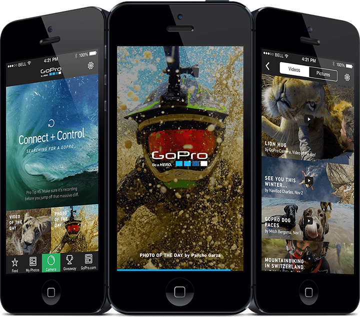
Before
Technically the app is great and everything works, but I think the user interface and visuals are not equal to GoPro’s strong action sports brand
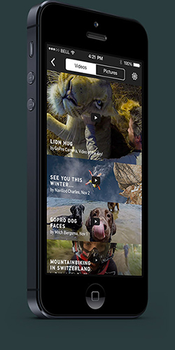
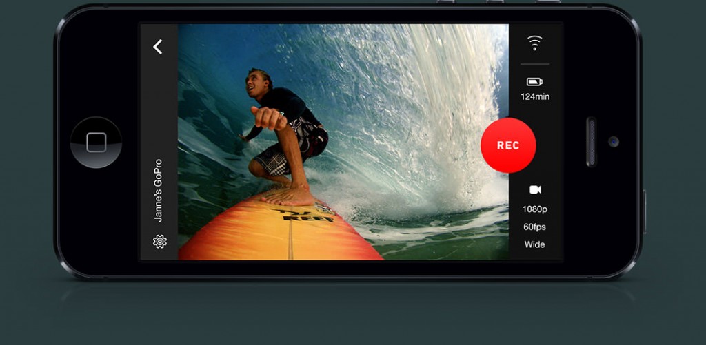
After
Kept all the functions alive, but with simpler and larger visibility and can easily use the app without pressing all the buttons at once.
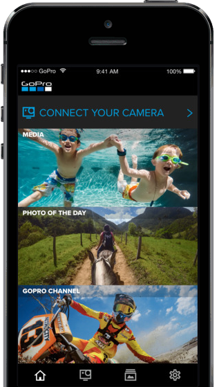
Briefing Cont. 1
In a redesign project, you’ll have to value every element of the current design – and decide if the element is important enough to keep or not. I re-thought the bottom navigation but kept the same elements on the home screen. Typography is based on GoPro’s own brand font, PF Din Text Pro – which is perfect for UI use with its vast array of weights and lowercase ascenders that are higher than the capitals.
Briefing Cont. 2
The recent launch of Apple’s new mobile operating system, iOS7, brought updated design guidelines and grids for designers and developers. I wanted the app to look fresh and well-thought out with smooth line icons and adrenaline pumping images without borders.